Hope everyone had a good Fourth of July weekend! You know what I learned this week? Sleep is awesome. I slept until like 11 AM or noon every day this weekend. I needed it. This new schedule I’m following is crunchy and has been requiring a lot of late nights. We’ll see whether it’s sustainable. This next month in particular might be pretty rough, since my normal development schedule is going to be upended by preparing for and attending regional events.
As I mentioned in last week’s video log, I’ll be at SGC up in Frisco the weekend of July 17-19, and then the weekend after that (July 25-26), I’ll be down in Austin for Classic Game Fest. I’ve been preparing materials for these events, including buttons and flyers to give away and a demo build of Super Win the Game that will hopefully be a little less aimless than last year’s “here’s the entire game, have fun” build.
Yay, @GunmetalArcadia / @MinorKeyGames flyers are here! pic.twitter.com/Sx30oi070K
— J. Kyle Pittman (@PirateHearts) June 30, 2015
I probably won’t be bringing a playable build of Gunmetal Arcadia to these events, as there just isn’t enough content yet to warrant it. (The weekly in-dev builds I’ve been posting are the full extent of the game at the moment.) But I would like to have some sort of Gunmetal presence, so I’ve been working on an intro cutscene that can double as a teaser trailer. I threw together a quick test of what an intro might look like a few days ago with placeholder art and text.
At the moment, I’m using an XML sheet to define slides for this cutscene as pairings of images and text. In the future, I want to add support for simple animation and parallaxing effects. I’m shooting for something in the style of Ninja Gaiden (and countless other NES games), and I’m pretty happy with how it’s looking so far. I’ll almost certainly use this system for an ending as well as the intro, and depending on how long it takes me to make these slides, I may interject cutscenes throughout the rest of the game as well.
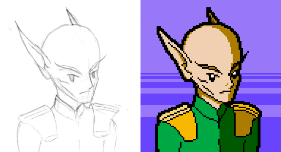
I’ve been having fun stretching my art legs a bit on this project. I have zero art training, and I know that it still shows a lot of the time, but I feel like I’m getting better at getting things to a “good enough” point where it doesn’t read as “embarrassing programmer art / replace before shipping.” I’ve been thinking more consciously about how to develop a consistent aesthetic for this game that feels authentic to NES games. I feel like I might’ve talked about this a bit in the past, but examining Faxanadu has been hugely revelatory in understanding how to play to the strengths and weaknesses of the NES color palette. Take a look at this scene from early in the game:
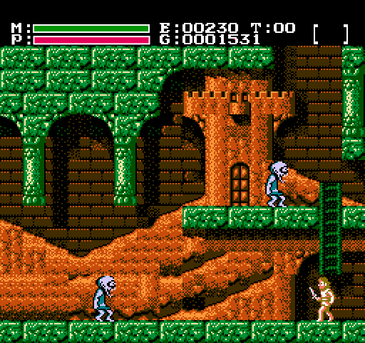
Notice how each element is monochromatic: the walls are green, the background is orange, the enemies are blue, and the player character is a sort of pinkish hue. The NES color palette is notoriously lacking in dark or desaturated colors, but the bright, bold colors it offers don’t necessarily have to appear cartoony. Delineating each element by hue allows the scene to remain legible even when elements overlap in brightness. The background ranges from bright pumpkin orange to dark brown to almost total blackness, but it all reads as a background element because it’s united by a common hue, and although its luma is roughly equivalent to that of the walls, there’s no confusion as to which elements are solid and which can be walked past.
It’s also worth noting that the walls have a brighter, more distinct highlight than the background elements, so even in grayscale, even with very similar luma, there’s enough of a difference to distinguish between the two. This highlight is also a slightly different hue than the rest of the tile (pale yellow versus the forest green that comprises the majority), but it still reads as monochrome.
Besides conveying functionality at a glance, this design also lends itself well to palette swapping, as I talked about some months ago. And speaking of palettes — awkward segue — I finally implemented a feature this week that I’ve been wanting to do since a very long time ago. I’ll be discussing it in more detail in Wednesday’s video log, but here’s a quick look at palettized screen fades.

It took two separate attempts and fairly disparate implementations to get this to a state I was happy with, but it works, it’s fast, and I think it’s going to be one of those sort of subtle, intuitively authentic look-and-feel things that helps sell Gunmetal Arcadia as something that could have believably existed on the NES.